LYFE CYCLE Website Redesign
Background
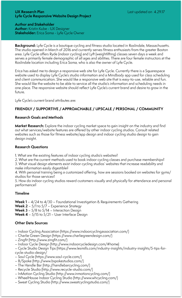
LYFE CYCLE is a boutique cycling and fitness studio located in Roslindale, Massachusetts. It opened in March of 2016 and currently serves fitness enthusiasts from the greater Boston area. LYFE CYCLE offers RYDE (indoor cycling) and LYFT (weightlifting) classes seven days a week and serves a primarily female demographic of all ages and abilities. There are four female instructors at the Roslindale location including Erica Soma, who is also the owner of LYFE CYCLE.
LYFE CYCLE’s current brand attributes are:
FRIENDLY / SUPPORTIVE / APPROACHABLE / UPSCALE / PERSONAL / COMMUNITY
Currently LYFE CYCLE has a Squarespace site listing studio information and policies. A separate Mindbody app is linked to the site and is used for the purchasing of classes and memberships, class scheduling and client communication. Erica asked me to redesign the Squarespace site to improve its content and visual design. Her main goals in completing the redesign were the following:
Enable customers to better understand the differences between RYDE and LYFT classes
Increase LYFT class enrollment
Reduce phone calls and emails to the studio about information that can be found on the site
In addition, the redesign would reflect LYFE CYCLE's current brand attributes as well as its desire to grow in the future. In addition to improving the site's content and visual design, Erica also asked me to refresh her branding as well as her logo wordmark.
Foundational Investigation and Requirements Gathering
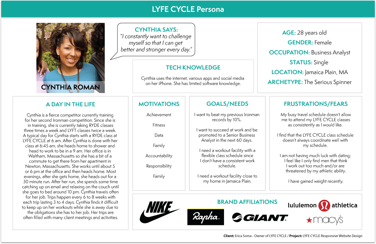
In embarking on this project, I first needed to understand LYFE CYCLE's customer base as well as the offerings of competitors in the market. Prior to conducting any research, I created provisional personas of what I imagined the three major LYFE CYCLE customer groups were. I used my existing knowledge of indoor cycling and being a LYFE CYCLE customer myself, to create these personas.
I created a UX research plan, formulating the following questions to guide my research:
What are the existing features of indoor cycling studio’s websites?
What are the current methods used to book indoor cycling classes and purchase memberships?
What visual design elements exist indoor cycling studios’ websites that increase readability and
make information easily digestible?With personal training being a customized offering, how are sessions booked on websites for gyms/
studios for those services?How do indoor cycling studios reward customers visually and physically for attendance and personal
performance?
I conducted both primary and secondary research for this project. I conducted a competitive analysis of the indoor cycling market space to gain insight on the industry and find out what services/website features are offered by other indoor cycling studios in the greater Boston area. In addition, I consulted the websites of companies specializing in fitness website/app design and indoor cycling studio design to gain insight on design philosophy and methodology.
I had several meetings in-person with Erica in this research phase to determine her design goals and objectives. I learned more about her business, the major pain points of her current site as well as what additional features she would like her site to have. I did some wireframing with her in these meetings as well, to flesh out the site's basic structure.
Experience Strategy
I sent out a survey to LYFE CYCLE's customer base to gather their demographic data and opinions on their experience with different aspects of LYFE CYCLE, including memberships, instructor quality and class preferences. I summarized the results of that survey, as well as my prior research, to understand what the average LYFE CYCLE customer looked like. Using that summary, I then refined my provisional personas to create two final personas representing the two major LYFE CYCLE customer groups. The Serious Spinner represented those customers attending classes several times a week and the Casual Spinner represented the customers that attended classes several times a month.
I created a UX strategy blueprint that addressed the following for LYFE CYCLE:
Challenges - What problems are you trying to solve and what obstacles must you overcome?
Aspirations - What are your ideal desired outcomes and what do you want to achieve?
Focus Areas - What is the scope of the strategy and what will you focus on for the most impact?
Guiding Principles - How will you overcome the challenges and what specific mantras will guide teams?
Activities - What types of activities solve the problems and what capabilities achieve my aspirations?
Measurements - What types of measurements will you employ and what metrics will be used to gauge success?
I created a product road map identifying the key features of the website organized by scenario and priority. To flesh out the basic structure and navigation of the website I also created a site map. To gain a greater understanding of user needs, I created a user flow.
Interaction Design
Using the data from my research findings, I created wire frames of the key LYFE CYCLE screen redesigns. In creating them, I also took into account LYFE CYCLE's brand attributes of:
FRIENDLY / SUPPORTIVE / APPROACHABLE / UPSCALE / PERSONAL / COMMUNITY
Below are those wire frames. (Click to enlarge)
User Interface Design
I created a Pinterest mood board to gather design inspiration for the redesign. I decided on typography and a color scheme. I redesigned the LYFE CYCLE logo to make it more upscale and modern, and created the designs below. (Click to enlarge)
In Summary
This project was particularly exciting for me as I got to help a local, woman-owned business in my community solve their design problems. I loved meeting with Erica and learning more about her business that she built from the ground up. I created a beautiful, modern and elegant design for her, with a clear informational hierarchy and an engaging, intuitive layout. With this new design, customers will be able to understand the difference between RYDE and LYFT, as well as easily find all of the relevant information they need, reducing the number of calls and emails to the studio.
This project is currently a work in progress. Erica and I are still iterating on the site today as she would like to look into having one site for the studio that has all her desired features, instead of having both the Squarespace site and the Mindbody app. She wants to add additional content as well, namely a blog for the studio that would have nutrition advice, health articles, as well as advertise events happening at the studio and around town.


